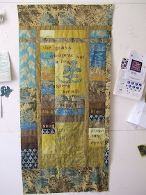
point the first: Consider the fact that the palette is COMPLETELY outside my comfort zone [ what can I say ? I thought it'd be a good challenge ... sigh ... shrug ]

point the second: After all the hours spent painstakingly embroidering grasses, they are toooooo subtle that they don't show up unless one's face is six inches from the bottom of the quilt

point the third:
I totally and irretrievably stuffed up the placement of the stencilling:
 'Long' is far too close to the reverse applique kanji. In my defense, the flipping stencil is opaque, making placement a bit of a crap shoot at best ... but I knew this ...I've done it before. I should have used one of those 'blue wash out pens that I hate so much' to trace the positions in before I reached for the oilpaint.
point the fourth: with so many hours already down the gurgler, you'd think I'd just toss it in the corner - or the bin - and move onto something else. That's probably what I'd advise someone else to do, surely ?
or at least take some time away from it ?
nope
stubborn
plus I know if I take it off that design wall and fold it up, I'll NEVER get back to it.
Why can't I do that ?
I've binned 'no hopers' before this
 'T'is a puzzlement!
surely it can be saved - so much work, so many good ideas - that beuatiful embroidery!
ReplyDeletecould some judiciously applied red help? either some lines of stitching, paint, foil or beads??? you could use some shiva stick along the embroidery perhaps to make it stand out more... i don't know if this is helping or making it worse
sending you hugs and inspiration vibes xxx
I like the idea of some red placement!
ReplyDeleteHowever please, please - don't bin it. I love the colours in it, and I'd hate to see something with so much work having gone into it, hit a bin. Frustrating though it may be!
Sending good vibes from up (down?) the road also!
Not a quilter so no advice - just an opinion.
ReplyDeleteIt's lovely :) It looks like spring at the sea shore - you know, in the marshes with the tall grasses.
It may not suit you, but it's still a beautiful piece of work!
In its defense - and as someone who is not its mum, so has not got the emotional involvement with it - I think it's beautiful.
ReplyDeleteIt looks like the view of Lake Michigan and the sand dunes in the winter, dry tan beach grasses and icy cold wind.
When we make art, what comes out is not always what we meant to.
I've often admired your work. It's a relief to know that you, too, can have "meh" quilts, ones which you feel ambivalent about.
ReplyDeleteThat said, it's subtle and pleasing. There are many people out there who would love it, and wish their work was of high a quality.
You're kidding right? Tell me you're totally kidding. Because I think that quilt is absolutely beautiful. Please, please don't toss it. If nothing else, I'll trade you oodles of yarn for it. I'd offer $$$ but as you know, I have none. :)
ReplyDeleteWell now you've pointed out the problems....
ReplyDeletei still think it looks great - and I wish I could take your beginners crochet class - I have a feeling crochet wopuld bunr up my stash faster than knitting....
And I've finally gor the otstanding blogs into single figure - first time in months - just when i'm supposed to be working...
"Hope" is a beautiful thing. And tenacity is even better. I say go for it! It's fabric. You can beat it.
ReplyDeleteI'll be over here cheering you on! Even the kitties are looking all encouraging!!!
I like it and don't think the placement is that off. I like the grasses on the bottom and the fact that you have to get close to see them. I am a very tactile person and I like being able to touch art (museums are a real trial for me). Don't throw it away. Put it away for a while and then change it if you must, but know there is someone who really admires it just as it is.
ReplyDelete